
-
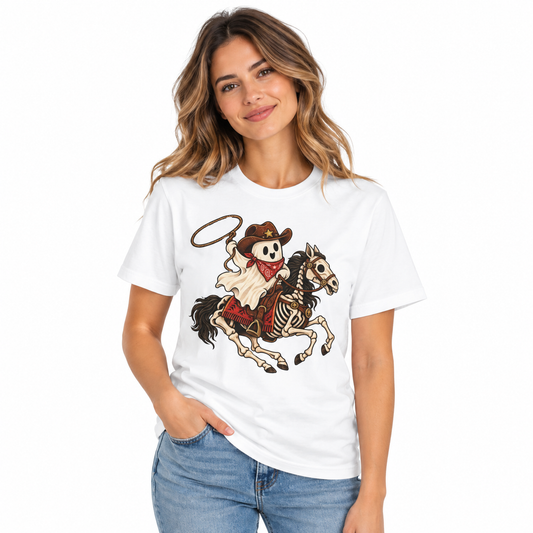
Women's Cowboy Ghost Shirt
Regular price From $35.95Regular priceUnit price per -
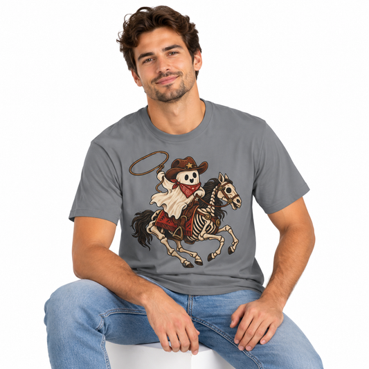
Men's Cowboy Ghost Shirt
Regular price From $35.95Regular priceUnit price per -
Men's Gentleman Otter Long Sleeve Shirt
Regular price From $44.95Regular priceUnit price per -
Men's Gentleman Otter Shirt
Regular price From $35.95Regular priceUnit price per -
Men's Iced Coffee Otter Shirt
Regular price From $35.95Regular priceUnit price per -
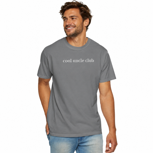
Men's Cool Uncle Club Shirt
Regular price From $35.95Regular priceUnit price per -
Men's Baking It's How I Hug Shirt
Regular price From $35.95Regular priceUnit price per -
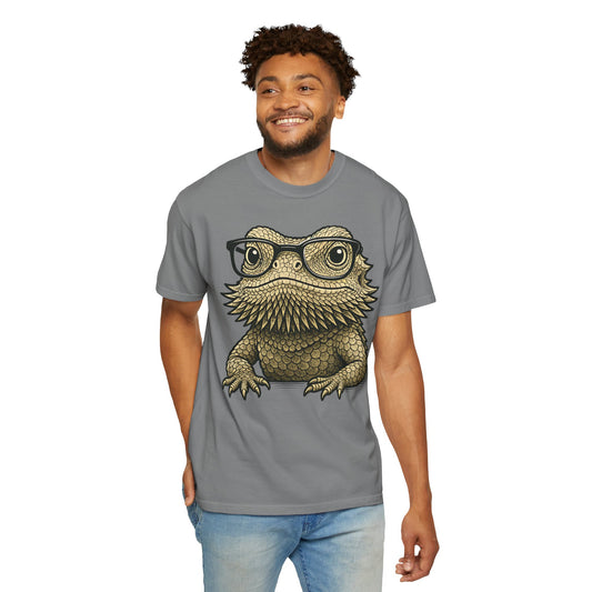
Men's Nerdy Bearded Dragon Shirt
Regular price From $35.95Regular priceUnit price per






Restraint is the whole trick
The tees that look best are almost always the ones doing least. A single well-drawn image, one or two ink colours, plenty of empty shirt around it. Designs that fill the entire front with text and effects read as merchandise; designs with breathing room read as clothing.
The base matters as much as the print
A great design on a thin, bright-white blank still looks cheap, because the shirt is doing nothing for it. Garment-dyed cotton in a muted tone gives artwork a softer surface to sit on, and the extra weight means the shirt holds a shape instead of hanging off you.
How to wear it
Let the tee be the only thing happening. Plain denim or work trousers, one outer layer, no competing patterns. The relaxed cut means it looks deliberate untucked, which removes the last decision.
Frequently asked questions
What makes a graphic tee look expensive?
Fabric weight, muted colour and restraint in the artwork. Busy prints on thin white cotton read as merchandise.
Are the designs original?
Yes. These are our own designs, not licensed characters or stock artwork.
Which colours look most understated?
Ivory, Hemp, Blue Jean, Pepper and Espresso.
Should I size up?
The cut is already relaxed. Size up one only if you want a deliberately oversized silhouette.
Front print or front and back?
Front-only tends to look cleaner. Back prints work when the design is simple and large.